Services Provided
Client Overview
Trading Buddies is an online community and platform for traders who want to learn, grow, and succeed together. Their mission is to make trading education simple, supportive, and accessible for everyone — from beginners to experienced investors.
They approached Two Brothers Media to create a brand identity that reflects their vision — a friendly, trustworthy, and modern space for traders to connect and grow.

Challenges
When the client came to us, they had only a name — “Trading Buddies” — but no visual identity.
They needed a professional logo and brand identity system that would:
Communicate trust, community, and knowledge.
Look modern and appealing for social media and digital platforms.
Stand out in the competitive finance and trading industry.
Our challenge was to design a logo that feels approachable like a friend, yet professional enough to represent financial credibility.
Our Approach
- Target Audience: Young traders, crypto enthusiasts, and investors looking for learning and community.
- Brand Personality: Friendly, modern, smart, and reliable.
- Competitor Analysis: We studied how other trading brands looked — many were too technical or intimidating. We wanted Trading Buddies to be different — simple, warm, and engaging.
- A symbol of connection or partnership to represent “buddies.”
- Elements like charts, graphs, or arrows to reflect trading and growth.
- Rounded shapes and soft typography to create a friendly tone.After sketching and exploring multiple ideas, we narrowed it down to 3 main concepts.
- Handshake Icon – representing friendship and trust.
- Rising Arrow + People Silhouette – showing teamwork and growth.
- Abstract “TB” monogram – simple, clean, and modern.
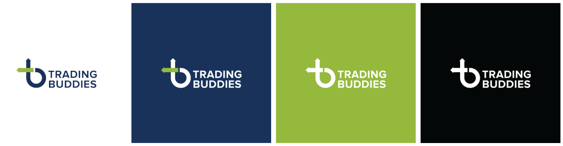
We refined each concept with different colors, fonts, and layouts — making sure each worked well on both dark and light backgrounds, social media icons, and mobile screens.
- Blue for trust, stability, and professionalism.
- Green for growth, money, and energy.
Typography was kept rounded and modern, to reflect friendliness and clarity.
Deliverables
We delivered:
Primary and secondary logo variations
Icon and favicon designs
Brand color palette and typography guide
Social media display kit (profile, cover, post templates)
Brand usage guide for future consistency
Impact
After the rebrand:
Trading Buddies gained strong visual recognition across social platforms.
The brand looked more professional and trustworthy, attracting more followers and learners.
The new logo became a symbol of connection and growth within their community.
Conclusion
The Trading Buddies logo design journey was all about transforming a simple name into a living, breathing brand identity.
Through research, creativity, and collaboration, Two Brothers Media built a visual identity that not only looks great — but truly represents what the brand stands for: growth, trust, and community.