Services Provided
Client Overview
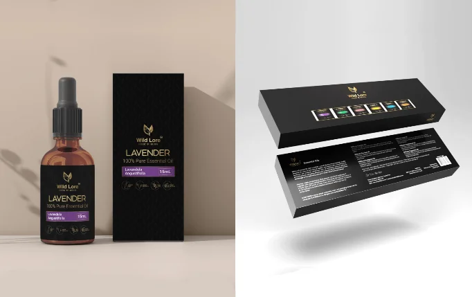
Wild Lore is a premium brand offering 100% pure essential oils, crafted from natural ingredients. Their philosophy, “Essence of Nature,” reflects their passion for purity, wellness, and sustainability.
They approached Two Brothers Media to create a modern, elegant packaging design that would represent the brand’s natural essence and premium quality while standing out in a competitive wellness market.
Challenges
The client’s main challenge was to build a distinct visual identity through packaging that communicates both luxury and nature.
They wanted the design to:
Look premium and trustworthy.
Highlight the purity of the oils.
Maintain consistency across different variants (Lavender, Tea Tree, Eucalyptus, etc.).
Appeal to modern consumers looking for quality natural products.
Our Approach
- The brand tone is calm, pure, and natural.
- The products are targeted toward health-conscious and luxury-focused customers.
- The identity should feel minimal yet powerful, capturing the “essence of nature” in a refined way.
- Botanical inspiration — using subtle patterns and textures that reflect nature.
- Luxury cues — black backgrounds, gold typography, and elegant layout.
- Consistency — a design system that can adapt across all product variants.
We created a few mood boards and digital mockups to visualize the brand’s personality balancing nature’s calmness with modern sophistication.
- A sleek matte black box with gold accents.
- Delicate leaf motifs to symbolize purity and organic origin.
- A clear hierarchy of information — product name, botanical name (Lavandula Angustifolia), and size (15mL).
- Color-coded labels (e.g., lavender purple for Lavender) to help differentiate each oil type easily.
Typography was carefully chosen — serif fonts for elegance and sans-serif for readability.
The back of the packaging included product details, directions, and ingredients, designed with clarity and alignment to regulatory standards.
- Accent Colors: Soft tones unique to each variant (Lavender, Lemon, Tea Tree, etc.).
- Material Choice: Matte finish with gold foil stamping for a high-end feel.
Deliverables
Product packaging for individual essential oils
Multi-variant box packaging design
Label designs with color-coded system
Brand and packaging guidelines
Impact
After Designing:
Wild Lore’s new packaging helped position the brand as a premium essential oil line.
The elegant design improved shelf visibility and customer trust.
The packaging became a core part of their brand identity, enhancing both in-store and online appeal.
Conclusion
The Wild Lore packaging design project was more than just about looks — it was about crafting a visual language that speaks purity, luxury, and nature in perfect harmony.
Through thoughtful design, Two Brothers Media helped bring the essence of nature to life — one drop at a time.